Improving Filtered Tables Through Iteration

ROLE & TEAM
Product Designer at Schedaero. Collaborated with a PM, Tech Lead, iOS Engineer, and another Product Designer who built the initial table foundation.
SUMMARY
I inherited a mobile-friendly table component and rapidly iterated on the filter and view experience, shipping three major improvements in one quarter that unblocked page releases and gave users powerful new ways to slice their data.
Problem Statement
Our fleet management software had a legacy tech issue —think of it like a four-layer cake where each layer is a different tech stack. Some of our most heavily-trafficked, feature-rich pages were built on legacy code that couldn't be updated anymore (the bottom slice of cake). They weren't responsive, weren't maintainable, and couldn't be filtered or exported.
Users were working around these limitations by exporting massive reports, opening them in Excel, and manually filtering to find what they needed. When we interviewed them about what kind of reporting they wanted, we realized they were already doing the work themselves because our tools couldn't do it for them.
So our table redesign initiative had been underway for 3 quarters. My talented coworker had built a mobile-friendly table template and successfully launched two new pages. But when I joined the team, the third page was blocked: users needed a way to get to "Past Trips" in one click (like the legacy page), but our new filtered interface required multiple clicks to create the same effect. Without solving for this, we couldn't launch.
And even on the pages that had launched, there were friction points: filters were hidden in a drawer, so users couldn't quickly adjust their search, and there was no way to see aggregate data without exporting to Excel first.
Project Goals
Unblock the third table page by solving for quick access to common views like "Past Trips"
Improve the filter experience so users could quickly adjust and refine their searches
Surface aggregate data so users didn't have to export to Excel just to sum a column
Build patterns that could scale across all table pages as we continued replacing legacy code
UX Methods
I came onto this project with momentum already built. The other designer and I had been collaborating weekly for months, so I was already familiar with the table designs. When I transitioned onto her team, I took over her tables and started serving both teams.
The foundation was strong: mobile-responsive, filterable, exportable. But we had specific pain points to solve, and we had one quarter to do it before the next page launch.
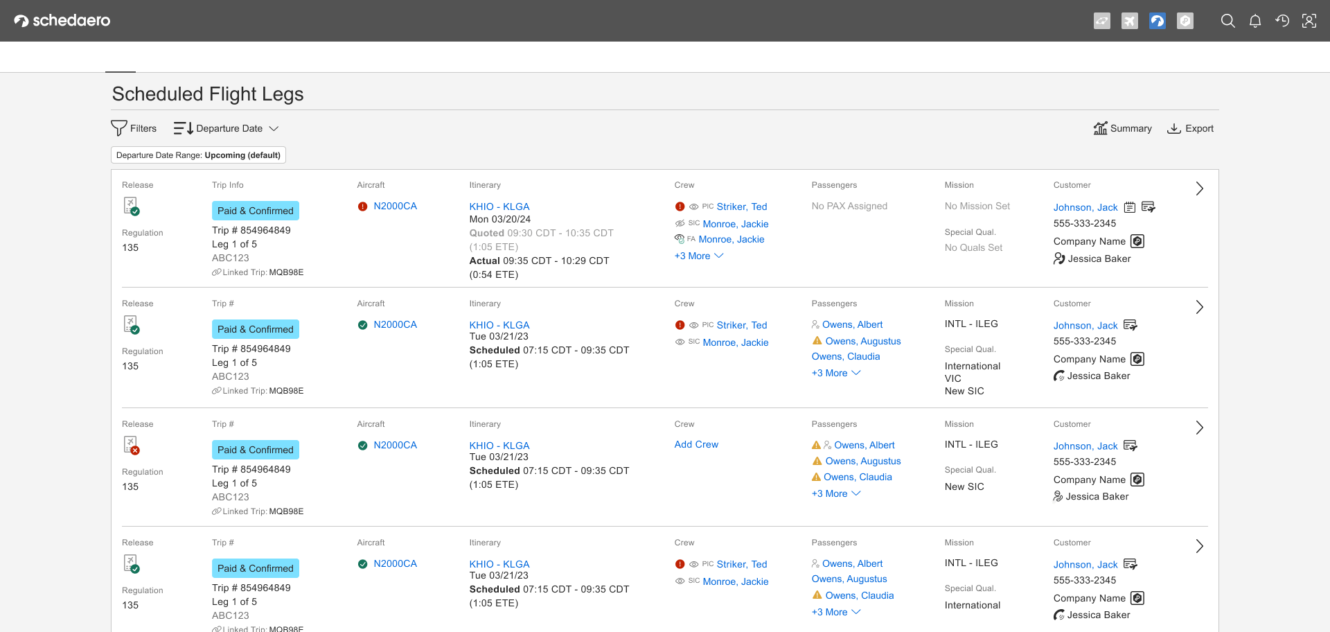
Pictured: Table before improvements had been made

The foundation was strong: mobile-responsive, filterable, exportable. But we had specific pain points to solve, and we had one quarter to do it before the next page launch.
We worked fast:
Collaborated closely with PMs and tech leads on both teams
Tested frequently with 3-5 customers during on-site visits (we had a lot of work travel during this period, which was perfect timing)
Broke improvements into shippable chunks so we could validate and iterate quickly
The improvements were all interconnected, so we tackled them in order of what would unblock the most value.
Key Focus Areas
How might we give users quick access to common views without sacrificing the flexibility of custom filtering?
How might we make it obvious which filters are currently applied, and make it easy to adjust them?
How might we surface aggregate data so users don't have to export to Excel just to sum a column?
Pictured: Wireframe sketch I produced during ideation session with trio

UX Solutions
Saved Views: Getting to Past Trips in 2 Clicks (with a Bookmark Option)
The legacy page let users get to Past Trips in one click. Our new filtered table was more powerful and configurable, but it took several clicks to manually set up that same view.
I designed a pattern for "static" saved views—pre-configured filter sets that could be applied in one tap. Past Trips became a saved view that applied the right filters instantly.
Pictured: Low to high fidelity versions of the Saved View components

But here's the clever part: I designed the pattern so it could scale. Static views (like Past Trips) were just the beginning. The same pattern could eventually let users save and name their own custom views. We weren't building custom views yet, but the architecture and interface pattern was there for when we were ready.
And if a user really needed Past Trips in one click? They could bookmark the filtered page. So technically, it was two clicks by default, but one click if you wanted it to be.
User response: When we showed this to customers, they immediately understood it. No explanation needed. They just started using it.
Interactive Filter Chips: See What's Applied, Remove What You Don't Need
The original table had a filter drawer. You'd open it, apply filters, close it. But once it was closed, you couldn't see what filters were active without opening the drawer again.
If your results weren't what you expected, you had to remember what you'd filtered by, open the drawer, adjust, close, and check again. It was tedious.
I designed interactive filter chips that lived outside the drawer, always visible. Each chip showed an active filter, and you could tap the X to remove it instantly—no need to dive back into the drawer.
This made the filtered state transparent and reversible. You could see at a glance what was narrowing your results, and you could quickly course-correct if you'd filtered too narrowly.
User response: Again, they just started using it. During testing, users would apply filters, see too few results, glance at the chips, tap one to remove it, and keep going. No confusion, no friction.
Summary Drawer: Aggregate Data Without Exporting

We kept hearing the same story: users would filter the table, export it to Excel, and sum up a column—usually "hours flown." They didn't need the export for anything else. They just needed one number.
So I designed a Summary Drawer. It showed aggregate data about the current filtered view, starting with the sum of hours flown (since we knew that's what they needed most).
We planned to iterate from there. We'd add a feedback text box where users could tell us what other aggregate data they wanted to see, and we'd add it in future releases.
This feature was in active development when my time with the company ended, but based on the pattern of user response to the other improvements, I'm confident it would have addressed a critical pain point
Pictured left: Figma artifacts showing different states of the table depending on filtering, plus how to trigger the summary drawer.
Outcomes & Impact
In one quarter, we designed, tested, and shipped two major improvements (Saved Views and Filter Chips) and had a third (Summary Tab) in active development. The new table pages unblocked releases and gave users powerful, flexible ways to slice their data—without needing to export to Excel.
What success looked like:
Users didn't comment on the improvements—they just used them. During testing, they'd filter, adjust, remove chips, and access saved views without hesitation or confusion. The UX faded into the background, which is exactly what we wanted.
The patterns scaled. Saved Views were designed to evolve into custom user-created views. Filter Chips worked across all table pages. Summary Tab was architected to grow based on user feedback.
We moved fast. Three improvements in one quarter, all validated with real users during on-site visits.
What I learned:
The best handoffs don't feel like handoffs at all. Because the other designer and I had been collaborating closely from the start, I didn't have to "learn" her system when I took it over—I'd already been part of shaping it. Regular cross-team collaboration meant I had context, not just files. And that made all the difference in moving quickly without breaking what was already working.
Frequent user validation = faster velocity. Because we were testing with customers every few weeks, we caught issues early and iterated with confidence.
Transparency reduces friction. Whether it's showing active filters or making saved views obvious, letting users see the system state makes tools feel more trustworthy and usable.